About the major parts of the user interface
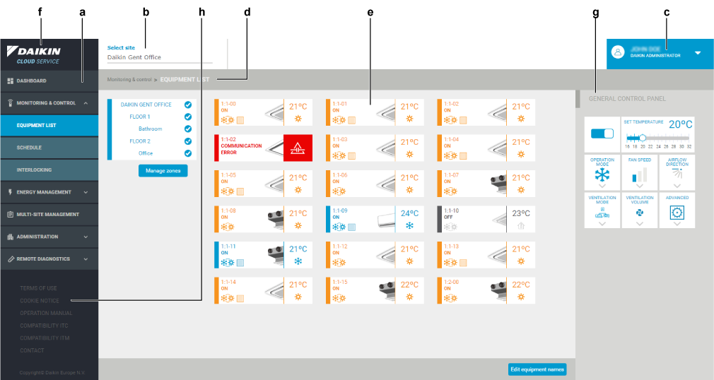
The user interface of the Daikin Cloud Service consists of the following major parts:

- The navigation pane (a), allowing you to navigate to the different functions of the application.
- An upper toolbar with a site selector (b) showing you all the installations and the user profile drop-down list (c).
- Breadcrumbs (d) that give you feedback on where you are in the structure of the user interface.
- A content section (e) displaying the current situation.
- The Daikin logo (f). Whenever you click on the Daikin logo field (f), the dashboard appears.
- The (g). Allows you to apply some advanced functions immediately to all units of a particular site. See To set advanced functions on all units at once.
- The footer section (h), which provides links to some useful pages. This includes the , , compatibility pages, and more.
INFORMATION

INFORMATION
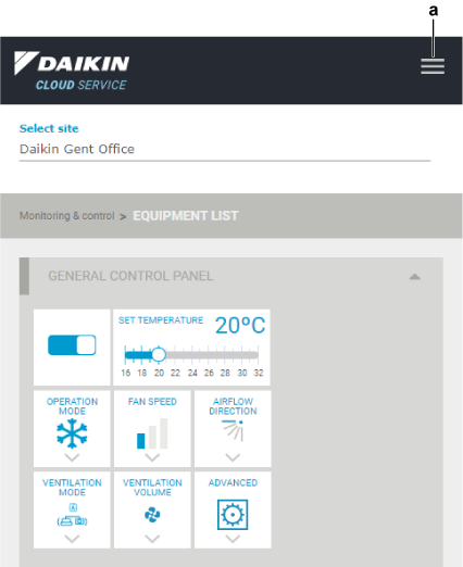
The user interface is responsive, which means it looks good on all devices (desktops, tablets, and phones). It will react to the available display size.
This means for example that the navigation pane is hidden on smaller devices.
When the navigation pane is hidden and you want to show it again:

1 | Click the "Hamburger" icon (a) in the upper right corner. |
- Result: The navigation pane is displayed on top.

